Showing posts with label Stampers Anonymous. Show all posts

Sunday, 2 December 2018

Festive Overlays

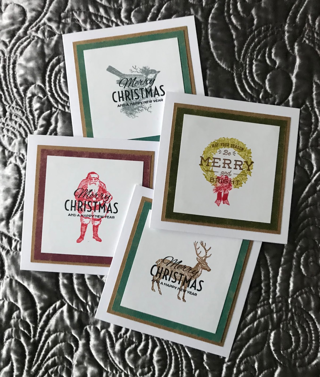
More Christmas cards have been made in super quick time thanks to Tim Holtz 2018 Holiday Hacks YouTube video inspiration. Here is the video if you have not seen it :
https://www.youtube.com/watch?v=K6UI-lKvOl4

My cards, all stamped with Distress ink (not oxides);


I've also used the same stamps for some other designs which are my own, here is one example;


The small holly branch makes a nice background but the interesting thing with this one was the blue that comes out in the stamping when you use frayed burlap distress oxide. I think my stamp was slightly damp when I stamped with it as it had been cleaned previously with a baby wipe.

This is a great set, probably my favourite of the 2018 TH Christmas release.

The Country View Challenge theme for December is Christmas so I would like to enter my stag Christmas card in that challenge.


Wednesday, 21 November 2018

Stencil Trees

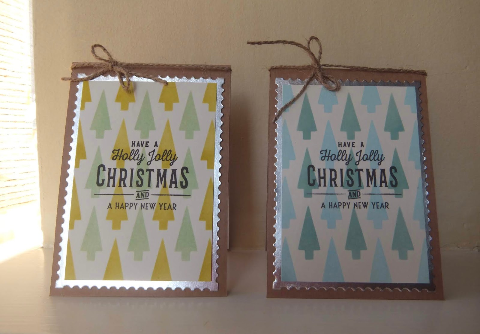
I am sharing a quick post today of two little Christmas cards I have made using the Tim Holtz shifter tree layering stencil.


Tim Holtz Stencil THS113
The sentiment is from Festive Overlay CMS357 by Stampers Anonymous Tim Holtz Collection.
The trees on the right are using Tumbled Glass and Evergreen Bough Distress Oxides and on the left, Peeled Paint and Cracked Pistachio.

I have made quite a lot of Christmas cards this year, if I get the time I will post some more.
Bye for now.

Sunday, 8 April 2018

Bunting and Banners

The topic this fortnight for the 2018 PaperArtsy Topic 6 is Bunting and Banners.
I was in the mood for a bit of collage and paper cutting so I have made this card.


Stamps used for this project :
PA Eclectica ELB14 by Lin Brown
It was nice to get that set out again, I've always liked that one.

Lots of stamping of windows, doors, bricks and bunting on some paper from my stash by Studio Light. Then lots of cutting out and re-assembling the house. It took hours, I spent ages fiddling with those tiny pieces until I was happy. This is a great way to use up all those pieces of paper you keep because you like them or those paper pads you bought and stored away and forgot about.

Tim Holtz Birch and Pine CMS280 stamp was used for the background, stamped on white card with Vintage Photo distress oxide ink.

I die cut the letters for "HOME" and added them to my banners and used a Tim Holtz paper punch for the folded circles on the bunting (a scrap of TH paper that I couldn't bear to throw away was just enough for these and they matched).

The panel was then mounted on Kraft card.
As it was a home themed card I felt I should photograph it in my home and guess what, it matches my new vertical blinds, this pleases me a lot.

Bye x


Sunday, 18 March 2018

A Postcard Adventure

The challenge on the Country View Crafts Challenge blog for March is Postcards (6x4).
A postcard should have a message so I thought my message would be one of the quotes from the new Tim Holtz Theories stamp set that I purchased recently :
"Blessed are the curious, for they shall have adventures". I like that quote a lot.

Here is my entry for the March challenge:


I used Distress oxides for the background : Vintage Photo, Fossilised Amber and Candied Apple.
Stamps used :
Tim Holtz : Theories CMS329 and Ornate Trims CMS326.
White dots added with a white gel pen.

I really like the sketchy, grungy silhouettes on the Theories set as well as the quotes and the Ornate Trims set is going to be ever so useful I think.
I am off to play some more.

Have a good week everybody x

Sunday, 6 August 2017

Dreamer Canvas

When the May 2017 issue of Craft Stamper magazine arrived on my doormat and I saw the stunning project in the article by Jenny Marples, I knew I wanted to give that a try. I often see projects I want to try and time goes by but with this one, it was still in my head three months later.

I've pretty much followed the instructions in the article but used PaperArtsy Fresco paints, changed the colours of some of the buildings and changed the words to make it my own.
Here is my finished canvas;


The paints I used for the background were Squid Ink (one of my favourites, love the name and the deep purple tone), Elephant, Slate and Sage.
This is the background before I started:


The next layer was stamped using white gesso and the Tim Holtz Halftone background stamp CMS260. Then I used my PaperArtsy mini MN18 for the letters and numbers in black and coffee archival ink. I didn't get photos at each stage although I intended to. I totally got lost in the project and three hours went by in a flash, I forgot to eat, it was great.

I spent ages die cutting the Tim Holtz suburbia buildings and adding the details, some of the parts are so tiny but it is worth the effort.  The photo below was taken outdoors so the background looks a bit more blue than it actually is.
Here's a close up :


I am really pleased with this one so huge thanks to the very talented Jenny Marples for the idea.

Enjoy your Sundays and see you again soon. x 

Sunday, 9 July 2017

Craft Barn Twelve Month Challenge : July

The July verse for the Craft Barn Twelve Month Challenge is :

Hot July brings cooling showers,
Apricots and gillyflowers.

We have to include a gillyflower so I googled gillyflower just to be sure. A gillyflower is a medieval term for any fragrant summer flower but typically refers to dianthus or carnation. So I used my Tim Holtz sketchy flowers for this page, I think they are carnations.


I started with distress ink on the background, mainly blues but with some cracked pistachio thrown into the mix. Then some stamping and masking of the flower heads in the background, I wanted to leave them sketchy and add one flower head as a focal image coloured apricot. I used Promarkers to colour that one, cut it out and stuck it on the page. 
I wasn't too happy with the background as I wanted it to look summery but as if it had been raining or was about to rain. I added some distress oxides in faded jeans and broken china plus water spritzing and tried to drip it a bit from the top of the page. It doesn't show that well in the photo but there are some very fine drips. OK, happy with that now. Oxides are just so good!

Monday, 29 May 2017

Illustrated Garden

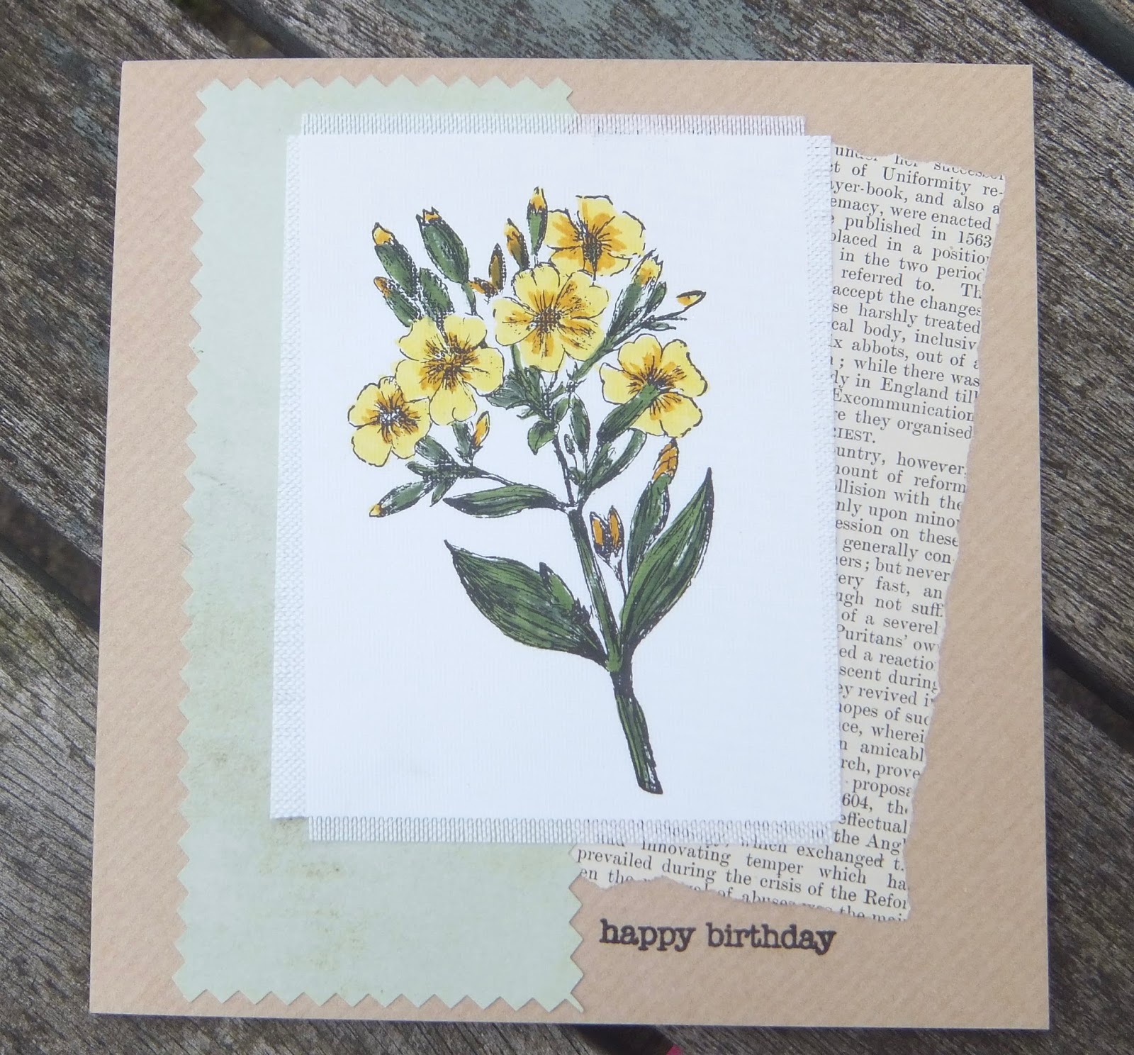
Today I would like to share a couple of cards I have made using the Tim Holtz Illustrated Garden stamp set by Stampers Anonymous.
For some time now I have wanted to try stamping on fabric and I thought the lovely vintage flower stamps would be perfect for this. The images are  stamped with black archival ink and coloured with TH distress markers on fine linen. I am quite pleased with the results.


The panels are mounted on paper cut with pinking shears and some torn book pages. 

Have a great week everybody and thank you for visiting.


Sunday, 30 October 2016

Alpha/Dictionary Challenge 2016 : V

Oh where did that fortnight go! Fortunately the clocks went back today so I got that extra hour to finish off my Craft Barn Alpha/Dictionary Challenge page for the letter V. Here it is;


I chose vacation for my "V"word and used my Travel Labels Tim Holtz stamp set adding a vintage suitcase image to complete the theme. All coloured with inktense pencils and watercoloured.

Enjoy the extra hour.


Monday, 5 September 2016

Alpha/Dictionary Challenge 2016 : O

It was Sunday morning and I spotted the next letter for the Craft Barn Alpha/Dictionary challenge was the letter O. I really only had Sunday to complete my page as I will be away next weekend and I didn't want to miss the deadline for any of these challenges. Thumbing through the pages of the dictionary I came across ornithology, a perfect word to showcase some of my Tim Holtz stamps.


Stamps used :
Nature Walk CMS181 from Stampers Anonymous Tim Holtz Collection.
Coloured with inktense watercolour pencils and a bit of tumbled glass distress ink for the egg.

This is a simple and quick one but I do like those TH stamps so a great opportunity to use them.

A big thank you to all of you who comment on my pages, I really do appreciate it and it encourages me to carry on. I really am enjoying this project.


Sunday, 22 May 2016

Alpha/Dictionary Challenge 2016 : A

A is for Aeroplane.
That is the word I chose for the Craft Barn Alpha/Dictionary challenge this time. I have a lot of aircraft related images so a great opportunity to to use up some of my Tim Holtz bits as a collage style page. Here it is :


All paper ephemera from Tim Holtz Idea-ology. The aeroplane is stamped onto white paper that was stained with distress stains, pumice stone and old paper, then cut out and added to the page. I added a small compass stamp to the passenger ticket to tie in the red and highlighted the definition. Job done, I hope you like it.

Sunday, 14 February 2016

Alpha/Dictionary Challenge 2016 : F

The word I chose for this fortnight's Craft Barn Dictionary challenge using the letter F, is Fashion.
This is a messy one but thanks to all who suggested sticking the pages of the book together, much easier.


Stamps used : Tim Holtz Runway
I started by attempting to brayer distress ink on the pages for the background and stamped some random bubble wrap in purple archival ink but I did not like the look of it so knocked it back with some chalk Fresco Finish acrylic paint. Images of the runway models are stamped in black versafine ink and coloured with distress markers.
I added the heart and border with a black pen.

This is my entry for the challenge,  a bit rushed as I had so little time this weekend but I'm glad it is finished.


Sunday, 4 October 2015

Love Lovely Life

Happy Sunny Sunday everybody.


Stamps used :
Stampers Anonymous : Tim Holtz Bird Crazy and Crazy Accessories
Craft Individuals : Alice Palace Love Lovely Life

Alice Palace panel stamped in black archival ink on glossy card tinted with victorian velvet distress ink. The crazy bird is coloured with Promarkers as is her hat and bunch of flowers.
Mounted on a dotty paper frame.


Sunday, 20 September 2015

London Fashion Week

I promised more TH Runway projects and it seems fitting that this card should make its appearance in London fashion week.
Back in July I had booked a place on a workshop with Helen Chilten using the runway stamps and watercolours. Unfortunately the class was cancelled but I wanted to have a go using stencils and watercolours anyway as this was the theme of the class.


Stamps used : Tim Holtz Runway, Tim Holtz Cityscapes by Stampers Anonymous.
Stencil : Prima Marketing "Stencil Bubbles".
Distress Markers used for the stencilling on watercolour card with loads of water : Tumbled Glass and Wild Honey.

For the stencilling I scribbled the distress markers on the stencil, spritzed with water and used it as a stamp. Then I used a dry baby wipe to move some of the colour left through the stencil and then added a third layer of bubbles with the same colours. I love the green that the wild honey mixed with tumbled glass makes.
The runway fashion models are stamped on white stamping card and coloured with Promarkers then cut out and arranged on the background.

This is my last minute entry for this week's Craft Barn Challenge which is to use stencils and/or masks.

Wednesday, 26 August 2015

Runway

The Craft Barn weekly challenge is to use spray. I thought that would be pretty easy but the first part of the challenge was to find my sprays as I'd not used them in a while.

I found some Fireworks sprays in Angel Pink and London Fog, a nice colour combination but, those little bottle nozzles get clogged up so they needed a good wash. The pink did not spray, the result was more of a blot but I liked it so went with it. My white teapot also got a bit of a makeover as some of it ended up there as well. I have to say, I don't recommend these sprays.
I got a much better effect using the Tim Holtz distress spray. It is easier to control and the colour is richer.

For the challenge I have made two note cards. The sprays are used for the backgrounds on watercolour card.


Stamps used :
Tim Holtz Cityscapes CMS224
Tim Holtz Runway CMS214

I stamped the images onto the watercolour card and masked them before spritzing the backgrounds with the sprays. The sentiment on the London version is a die cut and Bonjour is stamped. The panels are mounted on Kraft card and a bit of baker twine added to finish them off.

More Runway and Cityscapes to come, currently work in progress.


Saturday, 21 March 2015

12 Tags of 2015 : March

Here is my offering for the March TH tag.


Step by step instructions for Tim's beautiful butterfly version are on his blog:
http://timholtz.com/12-tags-of-2015-march/

I had to improvise this month as I have no texture paste for the stencilled lettering so I used Imagination crafts sparkle medium through the TH Schoolhouse stencil, I quite like the result but will try the texture paste and embossing powder technique on Tim's blog when I get hold of a pot of that paste.
I also have no butterfly stamp, at least not large enough for a focal image on the tag so I decided to use a cameo and frame. The loop pin I used to attach my butterfly charm was one I saved from a price tag on some clothing I bought recently, I knew that would be useful at some point. Always a good idea to save these things.

Here is a close up of the embossing.


I like the texture and Tim's tip to use clear embossing powder on black archival ink to avoid embossing powder dots.

The distress paints I used for my marbelled background are :
Crushed Olive
Evergreen Bough
Scattered Straw
Cracked Pistachio

I really enjoyed this one, good use of a few hours on a Saturday.

Saturday, 23 August 2014

Artful Times Challenge 62 - Sewing

The first set of Tim Holtz stamps that I ever purchased was Haberdashery so it was nice to revisit that set for the Artful Times challenge this fortnight. I decided to make a tag for my entry. Everything used on the tag with the exception of the word Couture uses Tim Holtz Ranger products. The word stamp was a silicon clear stamp, see the difference in sharpness when using exactly the same dye ink. I have to say, the red rubber is far far superior.


The background was made using distress stains : squeezed lemonade, pumice stone and antique linen, spritzed with water and dried with a heat gun. I then edged the tag with vintage photo distress ink.
Using pumice stone DI, I used the "Measured" stencil and then stamped the images in black archival ink and Red Pepper Adirondack dye ink.
The Tim Holtz Sizzix On the Edge die : Sewing was used to cut the embellishment for the bottom of the tag. This was coloured with distress stains and distress ink and glossy accents added to the scissors. I added three red buttons to finish off and the stitched ribbon.

Not wanting to waste any of the stain and ink I had left on my craft mat, I made a matching ATC.


This was fun.
Have a great bank holiday weekend wherever you are.

Sunday, 23 June 2013

Butterfly Twinchie

Challenge #2 on the Twinchies blog this month is Bees and Butterflies. A good opportunity to play with my Tim Holtz butterfly stamp. That lovely painted butterfly was just begging to be watercoloured but..... I didn't do that, maybe another day.
I made two twinchies with the same image. The first is stamped in black on a distress ink blended background. I used squeezed lemonade, mustard seed, peeled paint and mowed lawn. The butterfly is coloured with spiced marmalade distress marker. I added some black diamond stickles on the antennae and randomly on the card.


The second one is a prettier version. The background is worn lipstick distress ink lightly applied with a duster brush. Then I used wild honey and worn lipstick through a stencil to add some interest to the background. I like the way these two colours blend. The butterfly is stamped with rose bud memento dew drop and coloured with promarkers. Then I added a couple of gems.


I think I prefer the darker grungier one, I'm not sure. Perhaps I should have tried a watercolour version after all.

I got carried away the the butterfly and decided to make it into a card.


Black diamond stickle dots are added to the embossed frame which I coloured with mowed lawn and mustard seed ink and mounted on yellow textured cardstock. The edges were tinted with black soot distress ink to match the black accents and mounted on a white 6 x 6 card. A small bit of black soot got onto the frame hence the black paper flower which I think may have ruined the card. The yellow is too bright, I should have sanded it down I think.
You might have guessed I am not happy with this. I need to go do something else!