Monday 31 July 2017

Message in a bottle

I was having a play with some Studiolight papers and dies at the weekend and made a couple of collage cards. These are the results of my playtime;


All products used are by Studiolight from the Summer Feelings range.
6x6 Paper pad.
Dies Summer Feelings SF47
Decoupage labels sheet EASYSF576
Embellishments - pearls from stash

I liked the colours and the beach themes, fun to work with. The die cut starfish and feather were cut from kraft card and colour tinted with distress ink.

There are lots of birthdays in August so two more cards done.

Thanks for visiting today.


Sunday 23 July 2017

Playtime

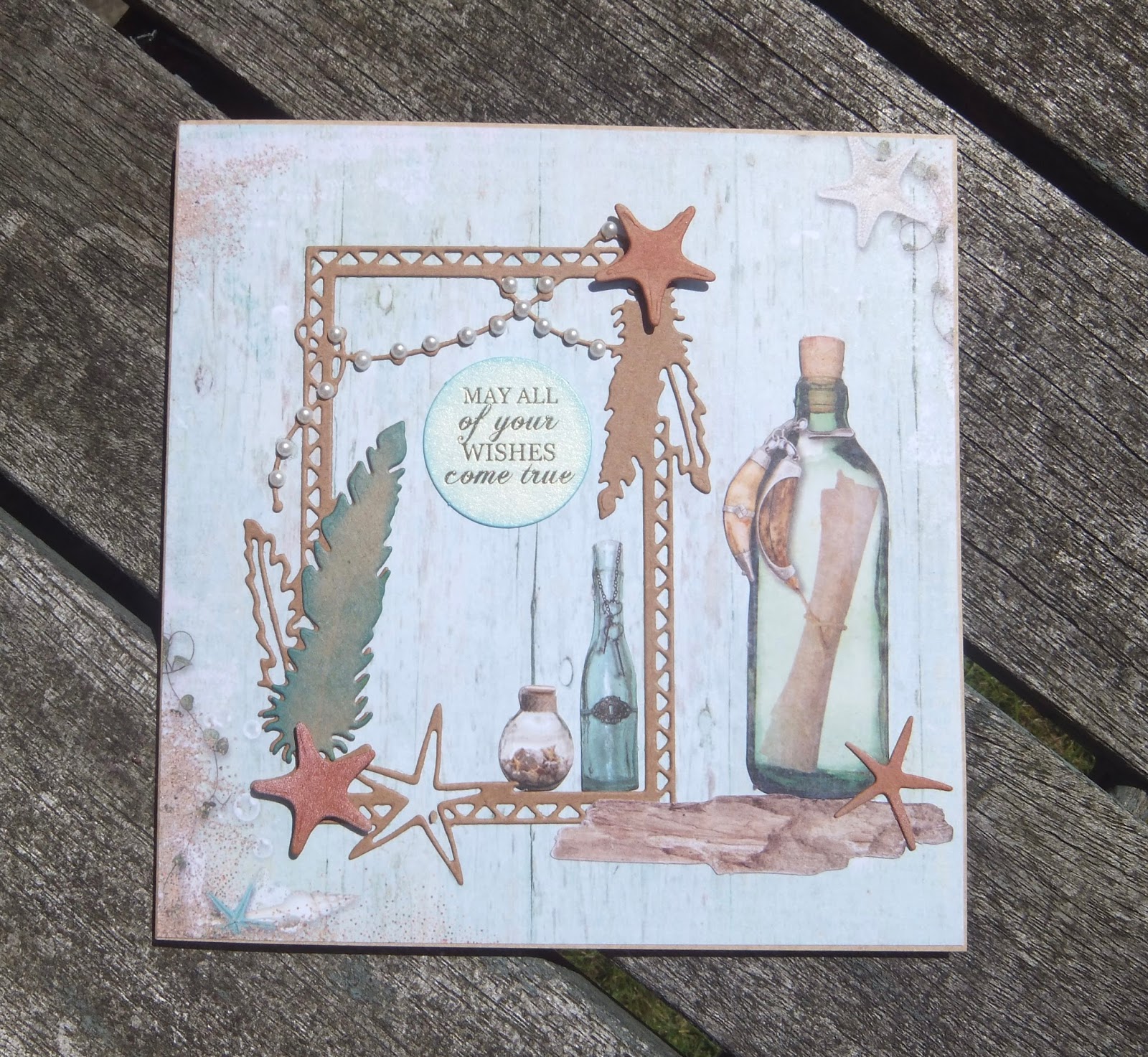
This afternoon I had a play with my Seth Apter bits and pieces. I love the abstract shapes of Seth's dies. Normally, I'm not a fan of die cutting (unless they are Tim Holtz dies of course, who doesn't like those) but the Spellbinder die I have from Seth's range cuts properly and is great fun to play with. Initially I just used a bit of old shiny card from my stash  just to see what the die looked like but ended up using it because it matches the limited edition paints quite well. I think I need to add more of these dies to my wish list!

Here are two cards I made with my panels, one is a card for a friend's 60th birthday in August.


Spellbinder Die : Seth Apter Splatter Proof
Numbers die cut using Sizzix Tim Holtz Boardwalk die 
Stamps : PaperArtsy Eclectica : E3 Seth Apter 04 
Paint : PaperArtsy Fresco Seth Apter Limited Edition : Smoked Paprika, Green Patina, Mud Splat, Key Lime.
Metallic effect card stock from stash.


Sunday 9 July 2017

Craft Barn Twelve Month Challenge : July

The July verse for the Craft Barn Twelve Month Challenge is :

Hot July brings cooling showers,
Apricots and gillyflowers.

We have to include a gillyflower so I googled gillyflower just to be sure. A gillyflower is a medieval term for any fragrant summer flower but typically refers to dianthus or carnation. So I used my Tim Holtz sketchy flowers for this page, I think they are carnations.


I started with distress ink on the background, mainly blues but with some cracked pistachio thrown into the mix. Then some stamping and masking of the flower heads in the background, I wanted to leave them sketchy and add one flower head as a focal image coloured apricot. I used Promarkers to colour that one, cut it out and stuck it on the page. 
I wasn't too happy with the background as I wanted it to look summery but as if it had been raining or was about to rain. I added some distress oxides in faded jeans and broken china plus water spritzing and tried to drip it a bit from the top of the page. It doesn't show that well in the photo but there are some very fine drips. OK, happy with that now. Oxides are just so good!