A clean and simple Christmas card for you today using Darcy's stag from PaperArtsy (EDY16).
This is a 5" by 5" card, the background kraft card is embossed with snowflakes and Christmas words from one of Tim Holtz 2017 stamp sets are around the border. It wasn't that quick to make as I had to fussy cut the stag after I had coloured him with Copics but there is no inky, painty business going on so nothing to clean up afterwards.
This will probably be my last post before Christmas so wishing you all a very Merry Christmas and best wishes for the festive season.
Showing posts with label PaperArtsy Eclectica. Show all posts
Saturday, 15 December 2018
Monday, 10 September 2018
One Cup at a Time
PaperArtsy Challenge Topic 15 : Artist Trading Coins
I like this challenge because I like artist trading coins and you can pretty much do anything that takes your fancy as long as the coins are 2.5 inches in diameter. Click on the linked title to go to the PaperArtsy blog and see the great selection of inspiration posted there.
Here are my tea themed artist trading coins using the lovely Scrapcosy tea stamps from ESC16.
Materials used:
Fresco Paints : Peach Nectar (the new Courtney Franich paint), Concrete, Vintage Lace (not the new Courtney paint, it is a very old one, one of my first purchases. I wonder if it is exactly the same as the new one).
Stamps : PaperArtsy Eclectica ESC16 by Scrapcosy
Watering Can archival ink
Have a good week everybody x
#scrapcosy
I like this challenge because I like artist trading coins and you can pretty much do anything that takes your fancy as long as the coins are 2.5 inches in diameter. Click on the linked title to go to the PaperArtsy blog and see the great selection of inspiration posted there.
Here are my tea themed artist trading coins using the lovely Scrapcosy tea stamps from ESC16.
Materials used:
Fresco Paints : Peach Nectar (the new Courtney Franich paint), Concrete, Vintage Lace (not the new Courtney paint, it is a very old one, one of my first purchases. I wonder if it is exactly the same as the new one).
Stamps : PaperArtsy Eclectica ESC16 by Scrapcosy
Watering Can archival ink
Have a good week everybody x
#scrapcosy
Saturday, 2 June 2018
Paper Dolls
PaperArtsy challenge Topic 10 : Paper Dolls
I just love these Tim Holtz paper dolls. Each character fires up my imagination. Who are they? What are they thinking?
These two are all dressed up but tough, serious little girls. I sent them out into the early summer woodland where there are foxgloves, butterflies and the sounds of birds singing.
Here is my small canvas for the challenge;
I just love these Tim Holtz paper dolls. Each character fires up my imagination. Who are they? What are they thinking?
These two are all dressed up but tough, serious little girls. I sent them out into the early summer woodland where there are foxgloves, butterflies and the sounds of birds singing.
Here is my small canvas for the challenge;
Ingredients.
Rubber Stamps : PaperArtsy EKC08 by Kay Carley
Fresco Paints : Glacier blue, Venice blue, Spanish mulberry and Steel grey.
Washi tape
Tim Holtz paper dolls
Tim Holtz paper punch butterfly
Happy weekend everybody x
Sunday, 20 May 2018
Vintage Neutrals
PaperArtsy challenge Topic 9 : Vintage Neutrals.
A great topic and some fabulous inspiration on the PaperArtsy blog. For my project I decided on a tag and my inspiration was Alison Bomber's beautiful tag which you can see under the above link.
My tag is nothing like Alison's apart from using Tim Holtz paper dolls for the focal image. I have used one of Alison's lovely quotes from the Dreaming and Doing set (Eclectica EAB07).
A great topic and some fabulous inspiration on the PaperArtsy blog. For my project I decided on a tag and my inspiration was Alison Bomber's beautiful tag which you can see under the above link.
My tag is nothing like Alison's apart from using Tim Holtz paper dolls for the focal image. I have used one of Alison's lovely quotes from the Dreaming and Doing set (Eclectica EAB07).
I started with a painted background with Chutney and Tikka Fresco paint which looked too dark so I knocked it back with some watered down gesso. Still too dark so I dry brushed chalk fresco paint on top of that. Then I used a Kay Carley stencil (PS061) to add some leaf fronds. The paint I used was Irish Cream.
I tried a bit of crackle glaze which worked a little but not very well, I will need to practice.
I added some flowers from ESC03 by Scrapcosy stamped with watering can archival ink and stamped the quote on a Tim Holtz die cut wood plank which I had painted with chalk and white fire paint. A couple of brads and a button to finish it off.
The photo looks a bit blue, that's the photography, there is no blue on my tag!
A great topic again and a chance to use some paper dolls. I am quite pleased with this one.
Sunday, 22 April 2018
Crafting with Kraft : PaperArtsy Topic 7
Kraft card is so versatile and I really like the natural effects you can achieve using it. For the latest PaperArtsy Challenge we use Kraft card as the base.
The PaperArtsy challenge blog for Topic 7 : Kraft Card has many inspirational ideas for using Kraft card.
I wanted to use a stencil for texture on my card and I was thinking leaves. I really like black and white on Kraft but to add some colour to the composition I decided to experiment with texture paste mixed with paint. Then I tried texture paste with infusions (Emerald Isle) and really liked the result.
Here are the experiments:
On the left is the texture paste applied through a stencil, sprinkled with infusions and a quick spritz of water. I really like that effect. The middle panel is a mop-up of the texture paste left of the stencil mixed with the infusions. The panel on the right is mermaid Fresco paint mixed with texture paste and applied to the stencil.
I stamped some leaves on Kraft card and cut them out. After arranging them on the panels I ended up with two cards. I think I know which one I like best.
PaperArtsy Stencil PS090 by Sara Naumann
Leaves and Wish sentiment from PaperArtsy ELB29 by Lin Brown
Quote on the second card from PaperArtsy EAB04 by Alison Bomber
Kraft card as a base material works for me for CAS cards so I prefer the Wish card with the bright mermaid texture paste but I am pleased with the effect of the infusions so will use that again maybe with a mixed media project.
Looking forward to seeing what everyone else has done for this challenge. x
Sunday, 8 April 2018
Bunting and Banners
The topic this fortnight for the 2018 PaperArtsy Topic 6 is Bunting and Banners.
I was in the mood for a bit of collage and paper cutting so I have made this card.
Stamps used for this project :
PA Eclectica ELB14 by Lin Brown
It was nice to get that set out again, I've always liked that one.
Lots of stamping of windows, doors, bricks and bunting on some paper from my stash by Studio Light. Then lots of cutting out and re-assembling the house. It took hours, I spent ages fiddling with those tiny pieces until I was happy. This is a great way to use up all those pieces of paper you keep because you like them or those paper pads you bought and stored away and forgot about.
Tim Holtz Birch and Pine CMS280 stamp was used for the background, stamped on white card with Vintage Photo distress oxide ink.
I die cut the letters for "HOME" and added them to my banners and used a Tim Holtz paper punch for the folded circles on the bunting (a scrap of TH paper that I couldn't bear to throw away was just enough for these and they matched).
The panel was then mounted on Kraft card.
As it was a home themed card I felt I should photograph it in my home and guess what, it matches my new vertical blinds, this pleases me a lot.
Bye x
I was in the mood for a bit of collage and paper cutting so I have made this card.
Stamps used for this project :
PA Eclectica ELB14 by Lin Brown
It was nice to get that set out again, I've always liked that one.
Lots of stamping of windows, doors, bricks and bunting on some paper from my stash by Studio Light. Then lots of cutting out and re-assembling the house. It took hours, I spent ages fiddling with those tiny pieces until I was happy. This is a great way to use up all those pieces of paper you keep because you like them or those paper pads you bought and stored away and forgot about.
Tim Holtz Birch and Pine CMS280 stamp was used for the background, stamped on white card with Vintage Photo distress oxide ink.
I die cut the letters for "HOME" and added them to my banners and used a Tim Holtz paper punch for the folded circles on the bunting (a scrap of TH paper that I couldn't bear to throw away was just enough for these and they matched).
The panel was then mounted on Kraft card.
As it was a home themed card I felt I should photograph it in my home and guess what, it matches my new vertical blinds, this pleases me a lot.
Bye x
Friday, 30 March 2018
PaperArtsy Topic 5 : Nautical Colours
A wet bank holiday Friday is a good excuse to play in my craft room and catch up with projects I want to do.
The theme for the PaperArtsy Challenge Topic 5 is Nautical Colours and the inspiration on their blog is particularly good again. I was away last weekend so had thinking time but no craft stash with me to start work on this one but I did have several ideas. Strangely, I did not use any of those ideas. I had planned on making a tag but I have ended up with a card using my Scrapcosy sea life stamps from PaperArtsy (ESC10 and ESC12).
I started by making a Gelli print background using Adirondak dye ink : Pool, Denim and Stonewash applied with a brayer. Then I stamped one of the Scrapcosy images in red geranium archival ink and took the print. I added some water with my fingers to bleach out some of the dye ink to make bubbles which were later doodled with a white pen.
The seahorse and shell were stamped and embossed with white Wow embossing powder and painted with a little bit of gold Fresco paint. To finish it off, I used a Woodware stencil around the edges to add some gold embossing powder (metallic brass sparkle by Wow) and stamped and embossed some words. A small gem was added for the seahorse's eye.
All mounted on red and blue cardstock and a 7" by 7" white card.
Here is a close up of the seahorse :
The theme for the PaperArtsy Challenge Topic 5 is Nautical Colours and the inspiration on their blog is particularly good again. I was away last weekend so had thinking time but no craft stash with me to start work on this one but I did have several ideas. Strangely, I did not use any of those ideas. I had planned on making a tag but I have ended up with a card using my Scrapcosy sea life stamps from PaperArtsy (ESC10 and ESC12).
I started by making a Gelli print background using Adirondak dye ink : Pool, Denim and Stonewash applied with a brayer. Then I stamped one of the Scrapcosy images in red geranium archival ink and took the print. I added some water with my fingers to bleach out some of the dye ink to make bubbles which were later doodled with a white pen.
The seahorse and shell were stamped and embossed with white Wow embossing powder and painted with a little bit of gold Fresco paint. To finish it off, I used a Woodware stencil around the edges to add some gold embossing powder (metallic brass sparkle by Wow) and stamped and embossed some words. A small gem was added for the seahorse's eye.
All mounted on red and blue cardstock and a 7" by 7" white card.
Here is a close up of the seahorse :
These are such detailed stamps that I thought the embossing might lose that detail but not so, it looks quite nice in natural light as it is shiny.
Happy Easter everybody x
Sunday, 18 February 2018
The Sea .... Again
This afternoon's playtime began with some Gelli prints. I wanted to make some backgrounds for my fish and sea creatures. I didn't really know where I was going with this when I started but I have ended up with three postcards.
I used Distress Ink applied to the gelli plate with a brayer, no oxides this time as I wanted a translucent look.
Tumbled Glass, Mermaid Lagoon, Milled Lavender and Dusty Concorde.
Then I stamped the seaweed and fish from PaperArtsy Eclectica ESC10 using Blue Violet and Cornflower Blue archival ink and took a print.
One of the panels has a moon. OK, no moon under the sea but we will call it a reflection I think.
Then I used black Versafine ink to stamp sea creatures and shells on the panels. I used some scrap card to stamp the words and coloured the letters with Distress markers, cut them out and stuck them on. Then I trimmed the panels and added some Dusty Concorde ink around the edges to finish them off.
Here are the three postcards.
I used Distress Ink applied to the gelli plate with a brayer, no oxides this time as I wanted a translucent look.
Tumbled Glass, Mermaid Lagoon, Milled Lavender and Dusty Concorde.
Then I stamped the seaweed and fish from PaperArtsy Eclectica ESC10 using Blue Violet and Cornflower Blue archival ink and took a print.
One of the panels has a moon. OK, no moon under the sea but we will call it a reflection I think.
Then I used black Versafine ink to stamp sea creatures and shells on the panels. I used some scrap card to stamp the words and coloured the letters with Distress markers, cut them out and stuck them on. Then I trimmed the panels and added some Dusty Concorde ink around the edges to finish them off.
Here are the three postcards.
I don't think I will ever tire of playing with my PA Scrapcosy sea themed stamps.
Sunday, 4 February 2018
Victory
When I saw the new PapaerArtsy releases by Scrapcosy I knew I had to order the ship stamp plate, that ship reminds me of HMS Victory and maybe it is an image of the Victory.
I played with a few techniques on these two cards and ended up with two similar but different results, one stormy vintage style and the other on a brighter day.
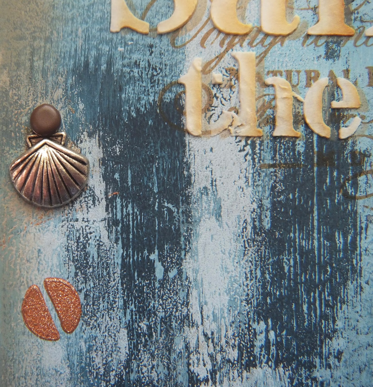
I tried out stencil bumping for the lettering but I used vintage photo distress oxide ink rather than archival ink, the result was quite weird but pleasing. The texture paste I used (Deco Art texture paste) reacted with the distress ink and the colour was absorbed into the paste. I quite like it. Here's a close up. It looks almost like wax in daylight.
The backgrounds for both panels which I have mounted onto cards are a mix of blues from the PaperArtsy Fresco range : Ice Blue, China Blue and Midnight. There is much more Midnight on the stormy version which is also edged with vintage photo distress oxide ink.
I found an old pot of Pinflair glitter paste in copper which I used for the screw heads. I am quite pleased with the rusty look of those.
The ship needed to be painted in HMS Victory colours so I used Nougat for the sails and Pumpkin Soup for the body of the ship. Here is photo of the Victory taken when I visited the Portsmouth Historic Dockyard in 2015.
Here is the brighter version of my ship panel;
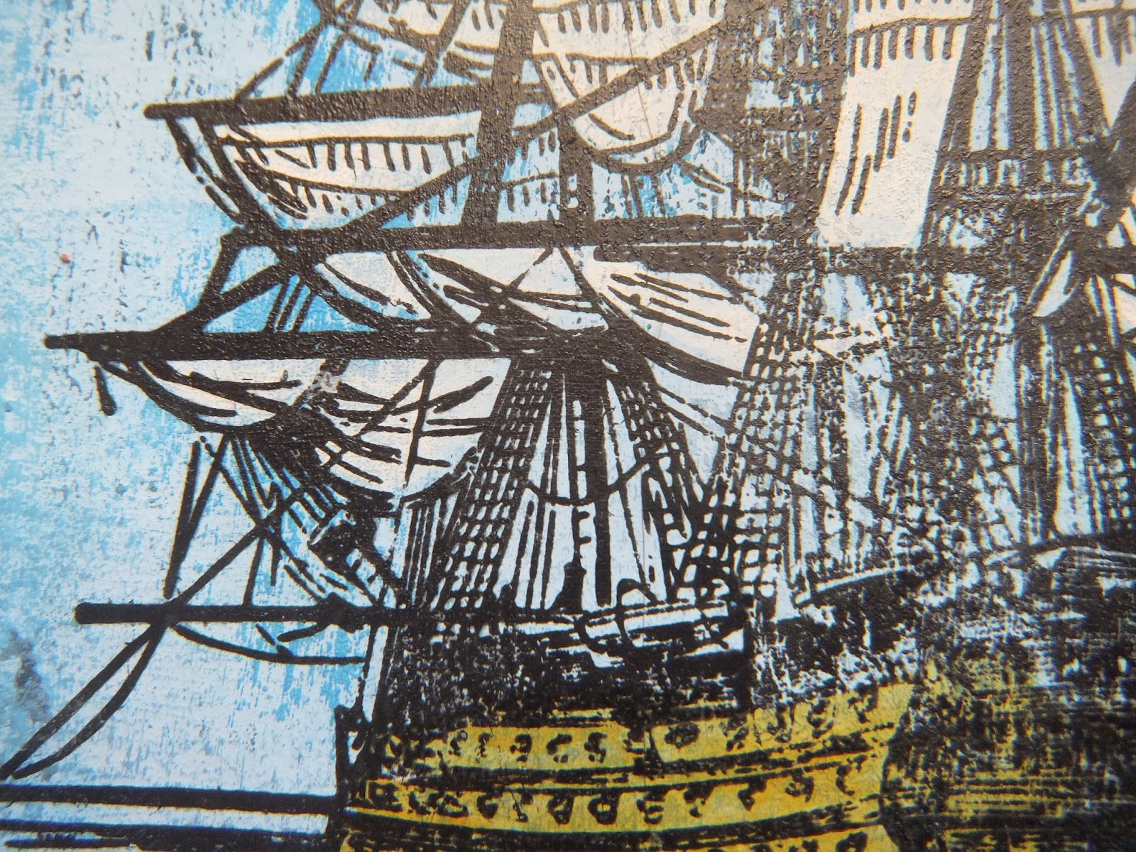
The images are stamped in black versafine this time. To get the detail of the sails and rigging I used my Tim Holtz stamp platform. I stamped the ship once, then painted the sails and body of the ship then stamped over it again so that the details can be seen. This is an easy way to paint these vintage images, especially when using opaque paints.
A close up;
I have a few more ideas for this stamp set but I have run out of weekend again! Hopefully I will get some more playtime next weekend.
Stamps used : PaperArtsy Eclectica by Scrapcosy ESC11
Stencil : PS094
Sunday, 28 January 2018
Under the Sea Take Two
Continuing with the underwater theme from last week, my new PaperArtsy Scrapcosy stamps arrived in the week. Here are the results of today's experiments.
All stamped images are from PaperArtsy Eclectica by Scrapcosy ESC10.
The background is made using Distress Oxides and images stamped with watering can archival ink.
The fish have been stamped with Faded Jeans Distress Oxide ink, painted with white fire Fresco paint and cut out. There is some oxide ink in the mix on the darker fish which was stamped with archival ink.
The white fire paint makes them look shimmery, here's a close up;
All stamped images are from PaperArtsy Eclectica by Scrapcosy ESC10.
The background is made using Distress Oxides and images stamped with watering can archival ink.
The fish have been stamped with Faded Jeans Distress Oxide ink, painted with white fire Fresco paint and cut out. There is some oxide ink in the mix on the darker fish which was stamped with archival ink.
The white fire paint makes them look shimmery, here's a close up;
Carrying on with the fish because they are great fun to work with, I made a couple of little cards.
They are small 4" by 4" cards. The images are stamped with black versafine ink this time with glossy accents on their eyes.
Finally, an experiment with a watercolour effect. These fish were second generation stamping spritzed with water (faded jeans distress oxide again). I cut it down to ATC size.
Go see Raquel's beautiful examples and inspiration on the PaperArtsy blog for this release, I loved playing with these fish.
http://blog.paperartsy.co.uk/2018/01/new-paperartsy-products-scrapcosy-jan.html
Thursday, 4 January 2018
Vintage Rose ATCs
ATCs (Artist Trading Cards) is the topic for the PaperArtsy blog challenge for January. Go check out the inspirational examples posted there.
I love making these miniatures as they are a great way to try out techniques and new stamp sets. I was given the PaperArtsy Vintage Rose set of stamps by Scrapcosy for my birthday in December so I chose to use them for my ATC entry.
I made a set of three. The backgrounds are painted with Fresco paints, the beautiful images stamped with black versafine ink and then I painted them with infusions mixed with metallic glaze. The smaller butterfly was painted, cut out and mounted on foam pads to add a little dimension to the middle ATC.
Stamp set : PaperArtsy ESC04 by Scrapcosy
Fresco Paints : Chalk, Mud Splat, Key Lime and Gold.
Infusions : Rusty Hinge, The Sage, Golden Sands
Metallic Glaze
A great topic for the challenge which has renewed my interest in ATCs.
I hope you like them.
I love making these miniatures as they are a great way to try out techniques and new stamp sets. I was given the PaperArtsy Vintage Rose set of stamps by Scrapcosy for my birthday in December so I chose to use them for my ATC entry.
I made a set of three. The backgrounds are painted with Fresco paints, the beautiful images stamped with black versafine ink and then I painted them with infusions mixed with metallic glaze. The smaller butterfly was painted, cut out and mounted on foam pads to add a little dimension to the middle ATC.
Stamp set : PaperArtsy ESC04 by Scrapcosy
Fresco Paints : Chalk, Mud Splat, Key Lime and Gold.
Infusions : Rusty Hinge, The Sage, Golden Sands
Metallic Glaze
A great topic for the challenge which has renewed my interest in ATCs.
I hope you like them.
Monday, 16 October 2017
Stamping with Water
I am still playing with Distress Oxides, I don't think I will ever tire of experimenting with them.
Here are some experiments using water with stamps and stencils.
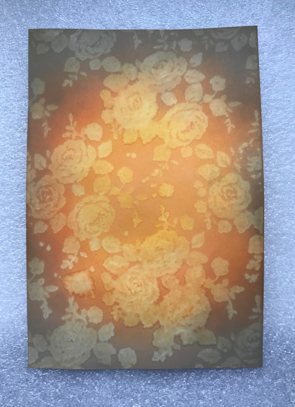
Background : Distress Oxides applied with a foam applicator - wild honey, spiced marmalade and frayed burlap. Starting in the middle of the card panel with the lightest colour and blending out to the frayed burlap at the edges. Then with a background stamp, I used a Tim Holtz floral background stamp, spritz the stamp with water and stamp it on the card. The water reacts with the oxide ink and removes some of the colour.
I like this one, it looks like vintage wallpaper.
Here are some experiments using water with stamps and stencils.
Background : Distress Oxides applied with a foam applicator - wild honey, spiced marmalade and frayed burlap. Starting in the middle of the card panel with the lightest colour and blending out to the frayed burlap at the edges. Then with a background stamp, I used a Tim Holtz floral background stamp, spritz the stamp with water and stamp it on the card. The water reacts with the oxide ink and removes some of the colour.
I like this one, it looks like vintage wallpaper.
The same idea with this one but this time I used a stencil (Tim Holtz : Shattered). Spritz the stencil with water and stamp with it, hold it in place for about a minute with a piece of kitchen roll on top of it to soak up any water that seeps out.
This one looks like a spiders web.
I used the background to make an Autumn panel.
Stamps used : PaperArtsy ESC05 by Scrapcosy and PaperArtsy ELB29 by Lin Brown.
Stamping with water is easy and lots of fun. Don't use too much water, just enough to make the stamp or stencil wet but not dripping.
Bye x
Sunday, 27 August 2017
Woodland Postcards
Here is one of my August bank holiday weekend playtime makes using my Scrapcosy woodland stamps.
I had a bit of a tidy up in the craft room recently and found some old cardstock with an interesting background. It acts as a resist if you add ink. I used Adirondack dye ink applied with a duster brush (raisin and caramel). I stamped the images with coffee archival ink and painted them with watered down distress ink (rusty hinge, gathered twigs and wild honey).
I added some wooden alphabet letters and a gem to finish them off and mounted them on dark red card stock.
I think you can see the resist background showing through on the mushrooms in the photo, in real life it shows all over the card which adds a nice subtle texture detail.
Stamps : PaperArtsy Eclectica ESC05 by Scrapcosy.
Ink : TH Distress Ink, Ranger Adirondack dye ink and Ranger Archival ink.
Sunday, 23 July 2017
Playtime
This afternoon I had a play with my Seth Apter bits and pieces. I love the abstract shapes of Seth's dies. Normally, I'm not a fan of die cutting (unless they are Tim Holtz dies of course, who doesn't like those) but the Spellbinder die I have from Seth's range cuts properly and is great fun to play with. Initially I just used a bit of old shiny card from my stash just to see what the die looked like but ended up using it because it matches the limited edition paints quite well. I think I need to add more of these dies to my wish list!
Here are two cards I made with my panels, one is a card for a friend's 60th birthday in August.
Spellbinder Die : Seth Apter Splatter Proof
Numbers die cut using Sizzix Tim Holtz Boardwalk die
Stamps : PaperArtsy Eclectica : E3 Seth Apter 04
Paint : PaperArtsy Fresco Seth Apter Limited Edition : Smoked Paprika, Green Patina, Mud Splat, Key Lime.
Metallic effect card stock from stash.
Monday, 26 June 2017
New PaperArtsy Stamps
I am loving the new PaperArtsy releases and I predict they are going to be costing me a fortune. My first purchase was Kay Carley's beautiful foxglove set EKC08 and the new stencil PS061.
Check out the PaperArtsy blog post, Kay's example's are stunning :
http://blog.paperartsy.co.uk/2017/06/new-paperartsy-products-eclectica-kay.html
Inspired by Kay's work I had a play and made up a couple of little cards. Here is one of them.
The background was an experiment with infusions which went a bit wrong so I used Chalk Fresco Finish paint on top of it, I quite like that effect.
I used Distress oxides Faded Jeans and Wilted Violet for the stencilling then stamped the smaller of the two foxgloves from the set in black. I added some of the other flowers in black and cornflower blue archival ink and coloured them with distress oxides. One of the bees is cut out and mounted on a foam pad so he stands off the foxglove.
That was fun, I know I will use the stamps and the stencil a lot.
Thanks to Kay and to PaperArtsy for another great release!
Check out the PaperArtsy blog post, Kay's example's are stunning :
http://blog.paperartsy.co.uk/2017/06/new-paperartsy-products-eclectica-kay.html
Inspired by Kay's work I had a play and made up a couple of little cards. Here is one of them.
The background was an experiment with infusions which went a bit wrong so I used Chalk Fresco Finish paint on top of it, I quite like that effect.
I used Distress oxides Faded Jeans and Wilted Violet for the stencilling then stamped the smaller of the two foxgloves from the set in black. I added some of the other flowers in black and cornflower blue archival ink and coloured them with distress oxides. One of the bees is cut out and mounted on a foam pad so he stands off the foxglove.
That was fun, I know I will use the stamps and the stencil a lot.
Thanks to Kay and to PaperArtsy for another great release!
Monday, 30 January 2017
PaperArtsy Pink and Orange Challenge
Having spent most of January drooling over the spectacular new releases from PaperArtsy and purchasing a couple of the new stamp plates I decided I should get busy and use them. The inspiration posted by Darcy for Topic #1 : Pink and Orange was fantastic, I could easily have been inspired by several of those ideas. I chose the fabric picture with sequins, the colours reminded me of sari fabrics which are typically hot colours with gold accents.
I have made a small canvas for my entry. My plan was to have pink and orange stripes in the background with sequins dotted around and then use my new Tracy Scott stamp set for the focal image. Here it is.
Fresco Chalk Paints :
Bougainvillea, Smoked Paprika, Pumpkin Soup, Rose, Old Gold.
(ooh - Bougainvillea blends so well with that Smoked Paprika paint, rather pleased with the result on the flower)
Stamps :
Eclectica ETS08 by Tracy Scott.
I painted some white card and then stamped the flower, cut it out and stuck it on the canvas. Same idea for the centre of the flower which was old gold on top of pumpkin soup.
Archival Ink:
Jet Black and Monarch Orange
Finished off with some sequins, gold flake and bit of gold sparkle pen on the stem.
Hope you all have a good week and thank you for visiting. x
I have made a small canvas for my entry. My plan was to have pink and orange stripes in the background with sequins dotted around and then use my new Tracy Scott stamp set for the focal image. Here it is.
Fresco Chalk Paints :
Bougainvillea, Smoked Paprika, Pumpkin Soup, Rose, Old Gold.
(ooh - Bougainvillea blends so well with that Smoked Paprika paint, rather pleased with the result on the flower)
Stamps :
Eclectica ETS08 by Tracy Scott.
I painted some white card and then stamped the flower, cut it out and stuck it on the canvas. Same idea for the centre of the flower which was old gold on top of pumpkin soup.
Archival Ink:
Jet Black and Monarch Orange
Finished off with some sequins, gold flake and bit of gold sparkle pen on the stem.
Hope you all have a good week and thank you for visiting. x
Subscribe to:
Posts (Atom)