Showing posts with label Tim Holtz Stencil. Show all posts

Wednesday, 21 November 2018

Stencil Trees

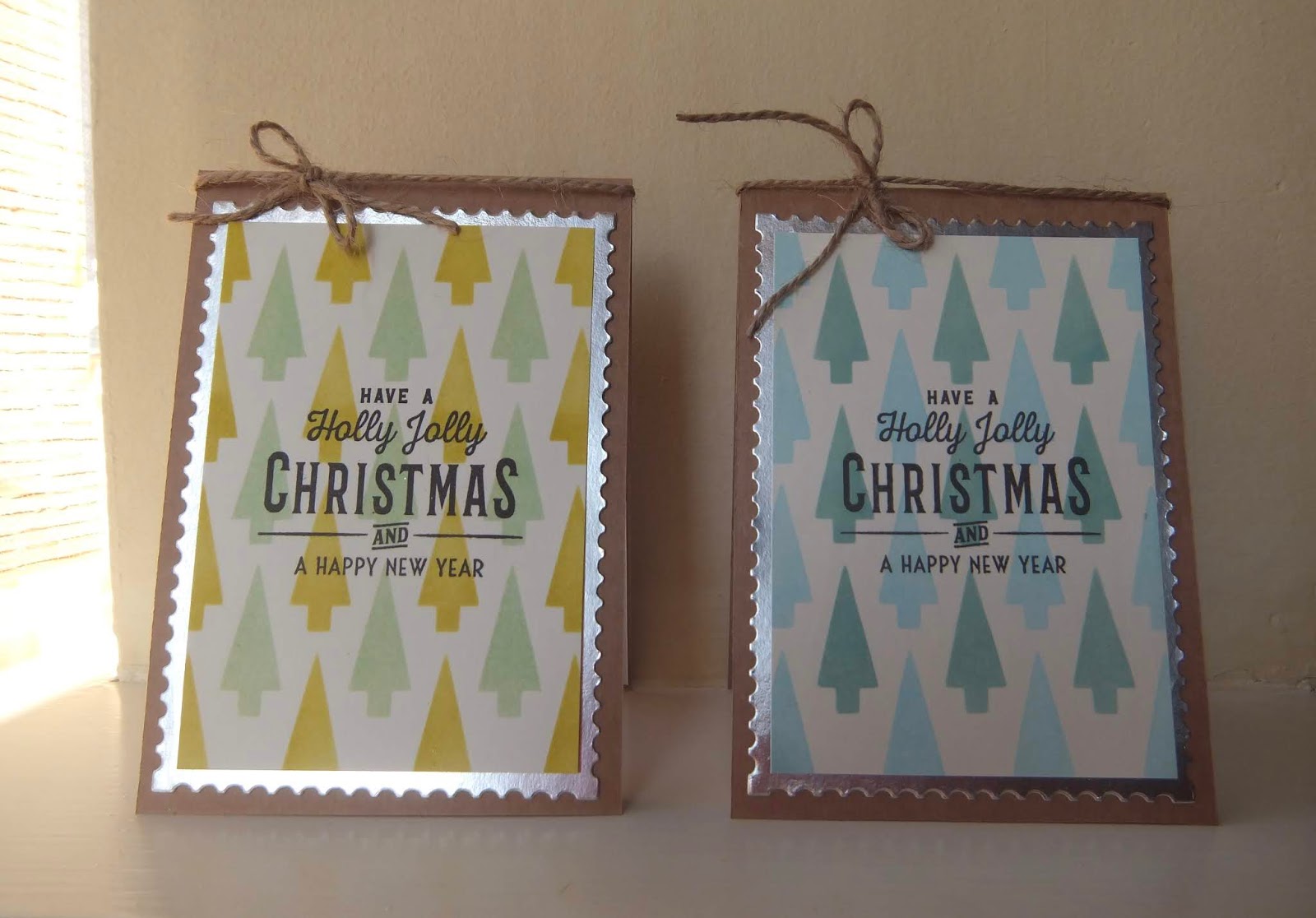
I am sharing a quick post today of two little Christmas cards I have made using the Tim Holtz shifter tree layering stencil.


Tim Holtz Stencil THS113
The sentiment is from Festive Overlay CMS357 by Stampers Anonymous Tim Holtz Collection.
The trees on the right are using Tumbled Glass and Evergreen Bough Distress Oxides and on the left, Peeled Paint and Cracked Pistachio.

I have made quite a lot of Christmas cards this year, if I get the time I will post some more.
Bye for now.

Saturday, 25 February 2017

Distress Experiments

Oh my goodness, I love the new Tim Holtz Distress Oxides.
I was relatively restrained and only ordered three colours, just in case I wasn't impressed. Well, that wasn't going to happen was it!
They arrived last week so this afternoon I had a little play. There is no finished project here, I just wanted to share some of my experiments with you.

The three colours I have are Vintage Photo, Iced Spruce and Spiced Marmalade. All the trials are on white stamping card.

First up, here are two panels showing the difference between Distress ink on the left and Distress oxide on the right. The oxides are muted colours when you add water, the inks are more vibrant. The finish is matt, just as advertised.


This is a link to a video of Tim's demo at Creativation by ScrapTimeVideos :
https://www.youtube.com/watch?v=3p92g4Kfnbw

The second panel originally had a bit of iced spruce ink mopped up from a previous project and I added the oxides on top. The oxides are opaque so on top of the ink but there are some little patches of the dye ink showing through.


So, what are they like to stamp with? Here are some comparisons.


See the colour difference between the iced spruce panels, isn't it lovely. The leaves are stamped with the vintage photo, the colour is very similar but spritz water on them and the magic happens. The dye ink separates from the oxide but the image is still there as the pigment is left behind, just not so sharp. Add more water, more separation.

Finally, what does distress ink look like on top of the distress oxide? 


For the tag on the right, I used the three colours as in the first photo. I spread the oxides on the craft mat, spritzed with water, dried with the heat gun, added more, dried again and so on until I was happy with it.  Watch Tim's demo, the technique is exactly the same as using distress ink. 
I used spiced marmalade distress ink through one of the new stencils (Floral THS077). Doesn't that look good. All it needs now is a focal image and maybe some embellishment and I think that would be quite a nice tag. I'll think about that later.
The small tag on the left is just me cleaning up the stencil with a baby wipe, we don't want to waste that ink do we! I'll find some use for that later too.

I highly recommend these oxides, I had great fun this afternoon with my new toys.


Sunday, 12 June 2016

Stars

The theme for the Craft Barn two weekly challenge is stars. All I could think of was stencilled stars as a background, that was what I wanted to do and I really have no idea what came into my head but I ended up with this card.


I stamped the focal image (JOFY JM30) and masked it out then add the stars with a Tim Holtz star stencil using Abandoned Coral TH Distress ink trying to fade the stars out in the middle around the pile of gifts. The edges are highlighted with Black Soot distress ink and to finish off the background I doodled around some of the stars. The gifts are coloured with distress pens.

I am not very happy with it, I think it is missing something but am not sure what. Maybe it should have a sentiment? Maybe it would have been better as a star background with a quote or sentiment as the focal image. I'll post it anyway, I have run out of steam with this one.

Saturday, 21 March 2015

12 Tags of 2015 : March

Here is my offering for the March TH tag.


Step by step instructions for Tim's beautiful butterfly version are on his blog:
http://timholtz.com/12-tags-of-2015-march/

I had to improvise this month as I have no texture paste for the stencilled lettering so I used Imagination crafts sparkle medium through the TH Schoolhouse stencil, I quite like the result but will try the texture paste and embossing powder technique on Tim's blog when I get hold of a pot of that paste.
I also have no butterfly stamp, at least not large enough for a focal image on the tag so I decided to use a cameo and frame. The loop pin I used to attach my butterfly charm was one I saved from a price tag on some clothing I bought recently, I knew that would be useful at some point. Always a good idea to save these things.

Here is a close up of the embossing.


I like the texture and Tim's tip to use clear embossing powder on black archival ink to avoid embossing powder dots.

The distress paints I used for my marbelled background are :
Crushed Olive
Evergreen Bough
Scattered Straw
Cracked Pistachio

I really enjoyed this one, good use of a few hours on a Saturday.